Hi readers! It's been a while. In the summer I usually focus on novel writing, so there's not much reviewing going on. There is, however, another creative outlet that I love working on to destress in the summertime: book covers.
Taylor Swift book covers, to be precise. That's right, today I have yet another album to present: her iconic 2017 album, reputation. Rep is really special for Swifties because it was when Taylor started to take back the narrative after some really painful and awful things happened to her. Many people who haven't heard the album assume it's entirely angry and bitter and overdramatic, but any fan could tell you that at the heart of reputation, there is a love story. The album is about finding real love in the midst of chaos, and what it takes to protect that relationship from judgement, gossip, and world-wide scrutiny.
So most of these covers are for some type of romance novel with crime or vampires or high school drama pasted on top, similar to the way rep era's "new Taylor" used dark colors and heavy drums to mask her love songs.
Unlike my 1989 book covers, these ones have spines. Designing book spines was surprisingly hard at first, but once I got into the swing of things, I thought they turned out fine. I also wanted to work on my design skills, so for many of the books I drew inspiration from specific aesthetics or covers within genres. Without further album over-analyzing or explanation, I present to you: reputation as books.
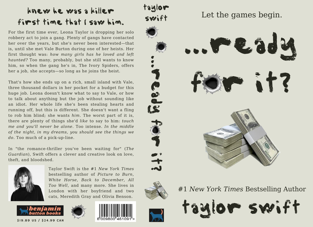
1. ...READY FOR IT?
I love this cover. "…Ready For It?" is packed with great lyrics (my personal favorite: "knew I was a robber first time that he saw me / stealing hearts and running off and never saying sorry") and super specific imagery. I originally considered making this a paranormal novel in ode to "if he's a ghost then I can be a phantom" but eventually decided to go the heist route. I made sure to keep the Elizabeth Taylor and Richard Burton reference in with the last names, as well as a thousand other lyrical references in the blurb. My biggest inspiration for this cover was The Cheerleaders by Kara Tomas. It's a different genre, so there's a different overall vibe, but I still love how it turned out.
I love this cover. "…Ready For It?" is packed with great lyrics (my personal favorite: "knew I was a robber first time that he saw me / stealing hearts and running off and never saying sorry") and super specific imagery. I originally considered making this a paranormal novel in ode to "if he's a ghost then I can be a phantom" but eventually decided to go the heist route. I made sure to keep the Elizabeth Taylor and Richard Burton reference in with the last names, as well as a thousand other lyrical references in the blurb. My biggest inspiration for this cover was The Cheerleaders by Kara Tomas. It's a different genre, so there's a different overall vibe, but I still love how it turned out.
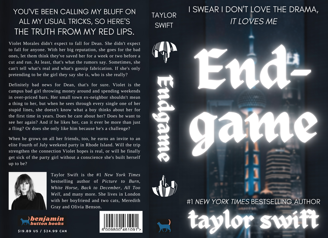
2. ENDGAME
"Endgame" is controversial to say the least. Many people were underwhelmed by it and still think to this day that it didn't deserve to be a single. I, on the other hand, am an adamant "Endgame" defender. How can you hate a song with the lyric "I bury hatchets but I keep maps of where I put 'em" and "I swear I don't love the drama, it loves me"? With this cover, I really wanted to show everything I love about the song: its heavy urban pop and rap influence, its fun lyrics, and its story. With three different people singing verses, the storyline can come across as a little muddled in the song, so I focused on bringing that out, as well as showing the true heart of it: a deep fear that someone's reputation will ruin their chance at real love. My favorite part of this cover is the spine, especially the distorted city graphic, which took me a minute to find but fit in perfectly once I did.
"Endgame" is controversial to say the least. Many people were underwhelmed by it and still think to this day that it didn't deserve to be a single. I, on the other hand, am an adamant "Endgame" defender. How can you hate a song with the lyric "I bury hatchets but I keep maps of where I put 'em" and "I swear I don't love the drama, it loves me"? With this cover, I really wanted to show everything I love about the song: its heavy urban pop and rap influence, its fun lyrics, and its story. With three different people singing verses, the storyline can come across as a little muddled in the song, so I focused on bringing that out, as well as showing the true heart of it: a deep fear that someone's reputation will ruin their chance at real love. My favorite part of this cover is the spine, especially the distorted city graphic, which took me a minute to find but fit in perfectly once I did.
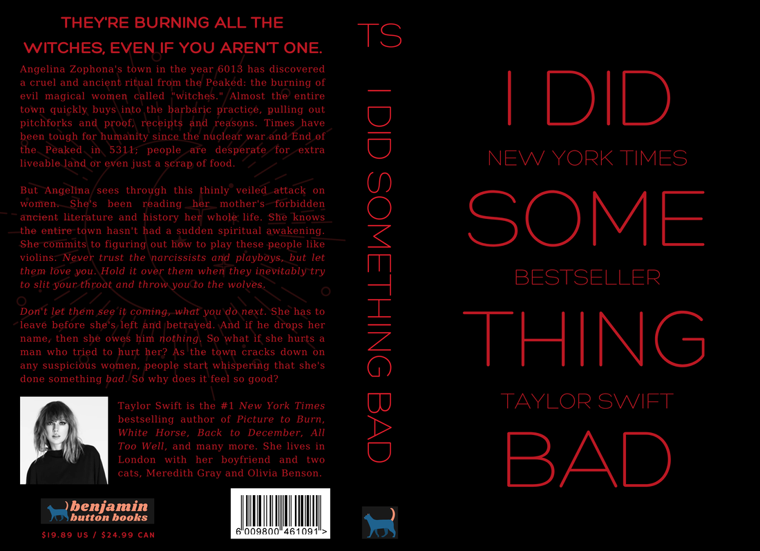
3. I DID SOMETHING BAD
"I Did Something Bad" is possibly her most iconic song. Not her most famous by far, but within the fandom, it pulls a serious amount of weight. I knew I needed to use the witch metaphor, and something I especially love is when authors mix superstition with sci-fi. The simplistic cover wasn't my original idea and ended up coming out of just messing around, but it quickly became one of my favorites out of everything I've done. It's so ominous and evil—the reputation aesthetic if I've ever seen it. I really like the faint moon symbol behind the blurb; I think it adds subtle witch imagery without being overbearing or changing the look.
"I Did Something Bad" is possibly her most iconic song. Not her most famous by far, but within the fandom, it pulls a serious amount of weight. I knew I needed to use the witch metaphor, and something I especially love is when authors mix superstition with sci-fi. The simplistic cover wasn't my original idea and ended up coming out of just messing around, but it quickly became one of my favorites out of everything I've done. It's so ominous and evil—the reputation aesthetic if I've ever seen it. I really like the faint moon symbol behind the blurb; I think it adds subtle witch imagery without being overbearing or changing the look.
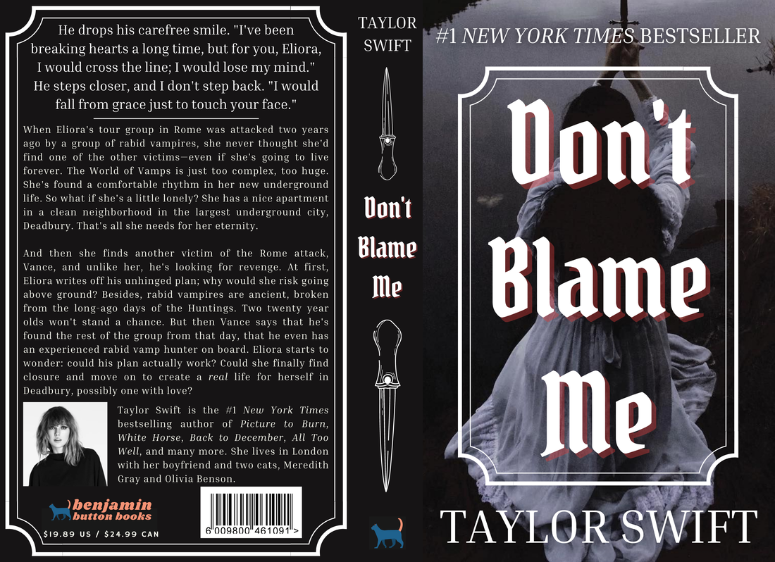
4. DON'T BLAME ME
Ask any rep stan (or Taylor fan in general) what the Swiftie national anthem is an I guarantee you they'll tell you it's "Don't Blame Me," specifically the jaw-dropping reputation Stadium Tour performance (unless they're a 1989 stan, then they might say heartbreak is the national anthem), so when I made this cover, I knew it needed to be able to hold its ground. The second I saw the photo, I immediately started messing around with it for this song, searching through an array of similar fonts before landing on this one, Pirata One. To give the book its own unique flair, I made it about vampires, drawing on worldbuilding influences from The Coldest Girl in Coldtown by Holly Black. My favorite part is once again, surprisingly, the spine, which came together quickly but fits the book well.
Ask any rep stan (or Taylor fan in general) what the Swiftie national anthem is an I guarantee you they'll tell you it's "Don't Blame Me," specifically the jaw-dropping reputation Stadium Tour performance (unless they're a 1989 stan, then they might say heartbreak is the national anthem), so when I made this cover, I knew it needed to be able to hold its ground. The second I saw the photo, I immediately started messing around with it for this song, searching through an array of similar fonts before landing on this one, Pirata One. To give the book its own unique flair, I made it about vampires, drawing on worldbuilding influences from The Coldest Girl in Coldtown by Holly Black. My favorite part is once again, surprisingly, the spine, which came together quickly but fits the book well.
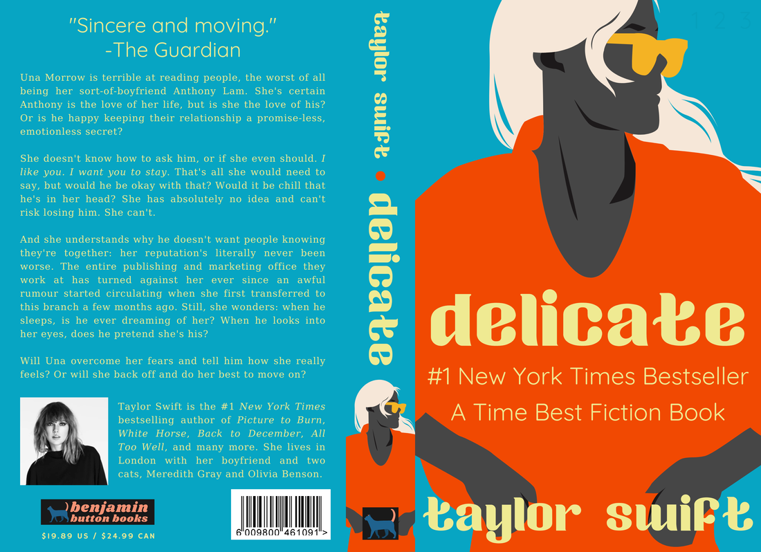
5. DELICATE
This is my favorite cover, bar none. It would be a bestselling hard-hitting memoir or realistic fiction debut novel, and you can't convince me otherwise. Look at the unusual, contrasting neon coloring! And the weird but modern font! And the tiny version of the graphic on the spine! I made this cover in about an hour on a day where I was feeling super creative and designed, like, four of my best book covers ever, each in their own genre (including a gorgeous Dune-inspired "False God" sci-fi that I can't wait to share). I think my favorite part is the coloring; I used one of the recommended Canva palettes and messed around with it until I had this pretty contrasting going on. Also, a note: deep fans might find a cute reference if they really search the top right corner of the front cover.
This is my favorite cover, bar none. It would be a bestselling hard-hitting memoir or realistic fiction debut novel, and you can't convince me otherwise. Look at the unusual, contrasting neon coloring! And the weird but modern font! And the tiny version of the graphic on the spine! I made this cover in about an hour on a day where I was feeling super creative and designed, like, four of my best book covers ever, each in their own genre (including a gorgeous Dune-inspired "False God" sci-fi that I can't wait to share). I think my favorite part is the coloring; I used one of the recommended Canva palettes and messed around with it until I had this pretty contrasting going on. Also, a note: deep fans might find a cute reference if they really search the top right corner of the front cover.
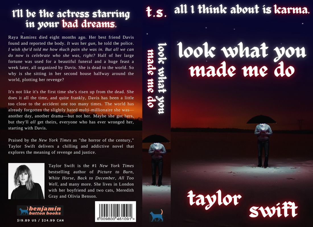
6. LOOK WHAT YOU MADE ME DO
Love it or hate it, "Look What You Made Me Do" was a cultural reset (but please love it because if you don't, what are you even doing here?). Like most of this album, I needed to make sure my book cover could survive when held up next to the world-affecting song, so similar to "Bad Blood," that meant going in a different direction than the music video. Coming back from the dead definitely needed to be a huge factor, but not in a zombie-survival kind of way—too music video. Instead, I wanted it to be an eerie thriller-horror, descent-into-madness as a girl tries to get revenge for her murder. Something I thought was fun was the "t.s." on the spine as a homage to the iconic music video beginning.
Love it or hate it, "Look What You Made Me Do" was a cultural reset (but please love it because if you don't, what are you even doing here?). Like most of this album, I needed to make sure my book cover could survive when held up next to the world-affecting song, so similar to "Bad Blood," that meant going in a different direction than the music video. Coming back from the dead definitely needed to be a huge factor, but not in a zombie-survival kind of way—too music video. Instead, I wanted it to be an eerie thriller-horror, descent-into-madness as a girl tries to get revenge for her murder. Something I thought was fun was the "t.s." on the spine as a homage to the iconic music video beginning.
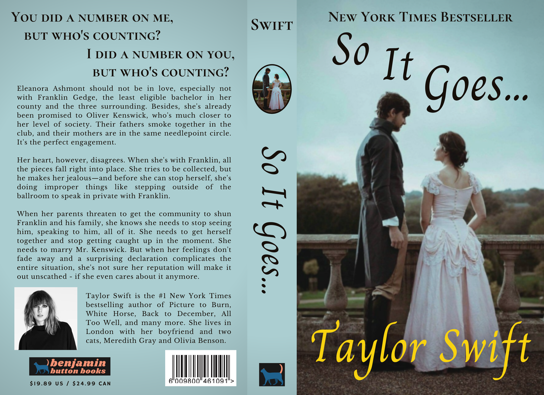
7. SO IT GOES...
"So It Goes…" stans (if you even exist) please don't kill me; I know I did this song dirty but just hear me out! I made the cover displeasing because it's supposed to be a low budget historical romance that barely made it off Wattpad but still became a bestseller because historical romance readers have numbers. See the heavy vignette? The odd yellow-gold coloring? It's supposed to be bad. The only part I genuinely enjoy seeing is the little oval photo on the spine because it reminds me of a historical fiction series I read as a kid.
"So It Goes…" stans (if you even exist) please don't kill me; I know I did this song dirty but just hear me out! I made the cover displeasing because it's supposed to be a low budget historical romance that barely made it off Wattpad but still became a bestseller because historical romance readers have numbers. See the heavy vignette? The odd yellow-gold coloring? It's supposed to be bad. The only part I genuinely enjoy seeing is the little oval photo on the spine because it reminds me of a historical fiction series I read as a kid.
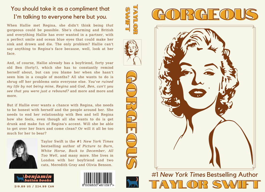
8. GORGEOUS
This cover just makes me happy to look at. It's not even the most book-ish and might be mistaken as an unauthorized Marilyn Monroe biography, but I don't care. I love it. I love the brown-tan-gold color scheme; I love the plot not shying away from the "but it's not my fault" aspect of the song; I love the lyric I chose for the top of the back cover. It's supposed to be experimental YA contemporary fiction à la Darius the Great is Not Okay by Adib Khorram (although, to be fair, I've never read that book, and it certainly has a much more impressive cover than this). I originally spent an entire day making a different cover for a fluffy rom-com set in an art museum before realizing that doesn't fit the song even a little bit (don't worry, I ended up being able to use it for Fearless (Taylor's Version)'s "Untouchable"). I'm not sure I can pick a favorite part of this cover; the whole thing makes me too happy to pick one bit.
This cover just makes me happy to look at. It's not even the most book-ish and might be mistaken as an unauthorized Marilyn Monroe biography, but I don't care. I love it. I love the brown-tan-gold color scheme; I love the plot not shying away from the "but it's not my fault" aspect of the song; I love the lyric I chose for the top of the back cover. It's supposed to be experimental YA contemporary fiction à la Darius the Great is Not Okay by Adib Khorram (although, to be fair, I've never read that book, and it certainly has a much more impressive cover than this). I originally spent an entire day making a different cover for a fluffy rom-com set in an art museum before realizing that doesn't fit the song even a little bit (don't worry, I ended up being able to use it for Fearless (Taylor's Version)'s "Untouchable"). I'm not sure I can pick a favorite part of this cover; the whole thing makes me too happy to pick one bit.
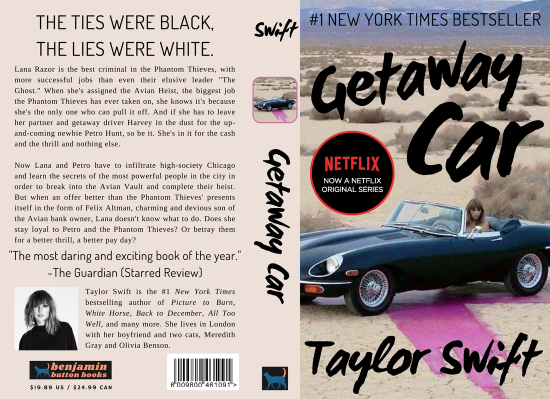
9. GETAWAY CAR
"Getaway Car" is special to probably every single person who's seen the video of Jack and Taylor coming up with the bridge. Anyone who knows this album knows that "Getaway Car" as a single would have destroyed every record and catapulted reputation beyond the angry persona of "Look What You Made Me Do" and "…Ready For It?". To pretend like it got the widespread attention it deserved, I used one of the images from the "Getaway Car" tour video and pretended it was from a Netflix TV show. It doesn't exactly fit the description I made, but this is the imagery she associates with the song, and I want to respect that in place of the chart respect this song should've received. My favorite part is the font of the title and the way I got the words to curve around each other. It's not the most bookish, but that's also the point: it was pulled from the TV show and slapped onto the book for recognizability.
"Getaway Car" is special to probably every single person who's seen the video of Jack and Taylor coming up with the bridge. Anyone who knows this album knows that "Getaway Car" as a single would have destroyed every record and catapulted reputation beyond the angry persona of "Look What You Made Me Do" and "…Ready For It?". To pretend like it got the widespread attention it deserved, I used one of the images from the "Getaway Car" tour video and pretended it was from a Netflix TV show. It doesn't exactly fit the description I made, but this is the imagery she associates with the song, and I want to respect that in place of the chart respect this song should've received. My favorite part is the font of the title and the way I got the words to curve around each other. It's not the most bookish, but that's also the point: it was pulled from the TV show and slapped onto the book for recognizability.
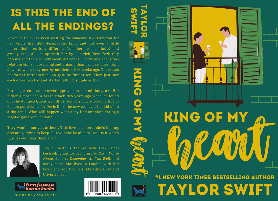
10. KING OF MY HEART
I feel like this cover looks like a real rom-com. I drew inspiration from books like The Hating Game, Red, White, & Royal Blue, and Fix Her Up. I think the font combination sticks to the genre but is just unique enough to be recognized, and the cooler color scheme will stick out next to a lot of pink and red books, the two most popular colors for rom-com covers. The blurb does a nice job of sticking to the song while adding more conflict. I'm most proud of the bricks on the front cover, which I had to build myself from way too many individual lines.
I feel like this cover looks like a real rom-com. I drew inspiration from books like The Hating Game, Red, White, & Royal Blue, and Fix Her Up. I think the font combination sticks to the genre but is just unique enough to be recognized, and the cooler color scheme will stick out next to a lot of pink and red books, the two most popular colors for rom-com covers. The blurb does a nice job of sticking to the song while adding more conflict. I'm most proud of the bricks on the front cover, which I had to build myself from way too many individual lines.
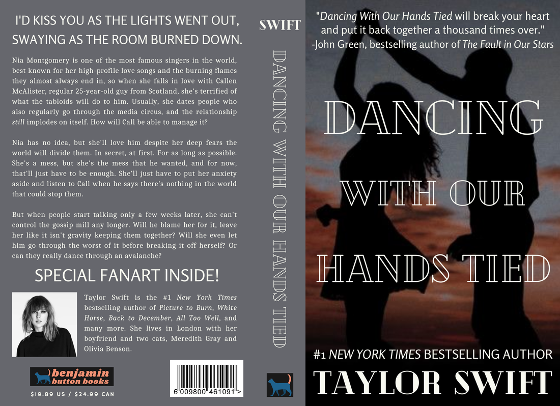
11. DANCING WITH OUR HANDS TIED
This book and I went through quite the ordeal. I found the photo quickly but went through about a hundred drafts of messing around with the fonts and placement of literally everything. I knew it had to be a tragic love story because despite its upbeat production, this song is sad. I think that the font I landed on fits perfectly, especially with the effect on the font for her name. I also love the John Green quote I added—complete with a "How You Get The Girl" reference—because he's definitely the king of YA tragic romance (see: The Fault in Our Stars and Turtles All the Way Down). Overall, while it's not my absolute favorite on the album, I feel like I made a solid cover for "Dancing With Our Hands Tied."
This book and I went through quite the ordeal. I found the photo quickly but went through about a hundred drafts of messing around with the fonts and placement of literally everything. I knew it had to be a tragic love story because despite its upbeat production, this song is sad. I think that the font I landed on fits perfectly, especially with the effect on the font for her name. I also love the John Green quote I added—complete with a "How You Get The Girl" reference—because he's definitely the king of YA tragic romance (see: The Fault in Our Stars and Turtles All the Way Down). Overall, while it's not my absolute favorite on the album, I feel like I made a solid cover for "Dancing With Our Hands Tied."
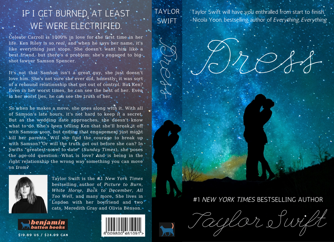
12. DRESS
"Dress" was an uphill battle for sure. It's probably the song I'm least familiar with on the album. I considered going a 50 Shades of Gray route, but I'm not super well-versed on adult romance covers, so instead, I decided to make it an older-YA illicit affair book (but with a much happier vibe than the song "illicit affairs"). I thought that would fit the "secret moments in a crowded room / they've got no idea about me and you" lyric. The set up is similar to "Dancing With Our Hands Tied" to show that they're closely related subgenres of romance. My favorite part is probably the constellation effect on the title; it took a while to add each little circle but was definitely worth it in the end.
"Dress" was an uphill battle for sure. It's probably the song I'm least familiar with on the album. I considered going a 50 Shades of Gray route, but I'm not super well-versed on adult romance covers, so instead, I decided to make it an older-YA illicit affair book (but with a much happier vibe than the song "illicit affairs"). I thought that would fit the "secret moments in a crowded room / they've got no idea about me and you" lyric. The set up is similar to "Dancing With Our Hands Tied" to show that they're closely related subgenres of romance. My favorite part is probably the constellation effect on the title; it took a while to add each little circle but was definitely worth it in the end.
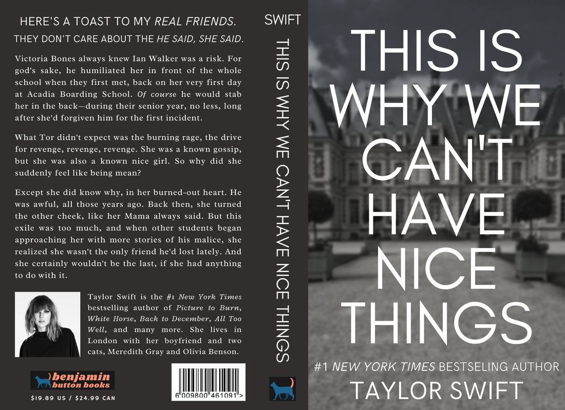
13. THIS IS WHY WE CAN'T HAVE NICE THINGS
"This is Why We Can't Have Nice Things" was one of the first covers I ever made. It came together quickly: once I found the photo and desaturated the color, all the pieces fell right into place (sorry, that was a terrible "So It Goes…" joke). I wanted this book to give E. Lockhart vibes, like the aesthetic of Disreputable History of Frankie Landau-Banks combined with the writing quality of We Were Liars. I feel like this book looks like a casual read that ends up being one of my all-time favorites. The spine is simple but filled out, which is great. Something random that I especially love is the name "Victoria Bones." I can't remember how I came up with it but it sounds and looks so lawful evil main character.
"This is Why We Can't Have Nice Things" was one of the first covers I ever made. It came together quickly: once I found the photo and desaturated the color, all the pieces fell right into place (sorry, that was a terrible "So It Goes…" joke). I wanted this book to give E. Lockhart vibes, like the aesthetic of Disreputable History of Frankie Landau-Banks combined with the writing quality of We Were Liars. I feel like this book looks like a casual read that ends up being one of my all-time favorites. The spine is simple but filled out, which is great. Something random that I especially love is the name "Victoria Bones." I can't remember how I came up with it but it sounds and looks so lawful evil main character.
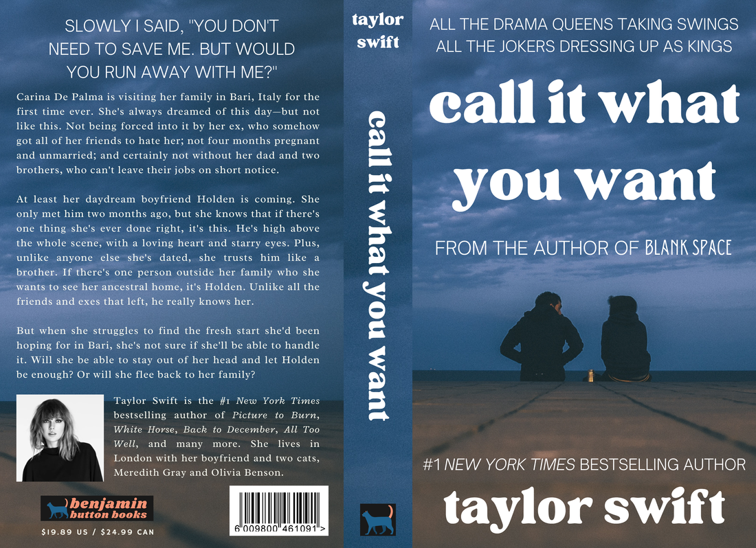
14. CALL IT WHAT YOU WANT
I found the photo for the "Call It What You Want" cover a long time ago but only finished it recently. I just didn't have many ideas for it; the picture's darkest night weather and happy couple fit the song so well, and I didn't want to make something not worthy of the amazing song. "CIWYW" has so many dedicated fans—for good reason, it's beautiful—and I needed to do right by them. While the description is a little awkward (I tried maybe too hard to add in lyrics), it decently fits the song. Besides, the real gem of the cover is the soft-looking title font. Doesn't it fit perfectly? I also really like the color scheme, with the white pop over the deeper browns and blues.
I found the photo for the "Call It What You Want" cover a long time ago but only finished it recently. I just didn't have many ideas for it; the picture's darkest night weather and happy couple fit the song so well, and I didn't want to make something not worthy of the amazing song. "CIWYW" has so many dedicated fans—for good reason, it's beautiful—and I needed to do right by them. While the description is a little awkward (I tried maybe too hard to add in lyrics), it decently fits the song. Besides, the real gem of the cover is the soft-looking title font. Doesn't it fit perfectly? I also really like the color scheme, with the white pop over the deeper browns and blues.
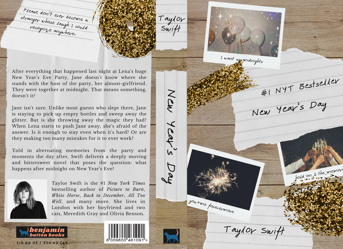
15. NEW YEAR'S DAY
One of the most underrated on the album, "New Year's Day" needed something melancholy and nostalgic. I originally looked for a photo of glitter and polaroids and a party mess before realizing, duh, if I have a vision then I should put it together myself. There were originally three more polaroids, but they were cut to keep it simple. I think the font is pretty similar to Taylor's handwriting, which is a fun little edition. The blurb is shorter than it probably should have been, but the star of the back cover is the scribbled down lyric at the top. My personal favorite part is the captions on the polaroids. I had a good time picking them out to match the individual photos.
There you have it, all my reputation book covers. Which was your favorite? I have to go with "Delicate," but I think overall this album looks really good—better than 1989, for sure. Recently, I've been considering doing this for other artist. "Fight or Flight" by Conan Gray would be fun, as would Ella Eyre's "If I Go." So you might get something like that in the future? But who knows?
Next time we'll probably be back to our regularly scheduled programing. A Leigh Bardugo review, perhaps? I can't say when another book cover album will be ready. Currently closest to finished is folklore with nine songs left, but that could take months, for all I know. Until next time, keep reading, readers.
