We have a strange one today, readers. A few months ago, I wanted to create more book covers, but I couldn't think of any books I liked that I could really improve, and I don't want to make something worse than the original—that's not the point. Instead, I started making book covers for Taylor Swift songs.
It's weird, I know, but anyone who knows me also knows that I love Taylor's music, whether it be country or pop or indie alternative, and anyone who knows Taylor's music also knows that she's famous for her lyrical storytelling. It's a running joke with Swifties that if she were to write a book, the whole literary world would freak.
While some people have made movie posters (including Taylor Swift herself, for the "Bad Blood" music video), that kind of graphic design is not in my wheelhouse, so I'm going album by album making a front and back cover (in paperback format, so there's a bio and a blurb) for a book AU with each song.
First up is the most-awarded pop album of all time, the iconic 80s-synth-pop-reminiscent 1989. Yes, I know that Taylor's Version could be dropped at any moment, and along with that more songs for the album, but this was the first album I finished. I'll add the Vault songs when they drop.
(A note: although there isn't any space between the front and back covers here, I have no spine. I just didn't think making a spine would be all that fun, so I didn't.)
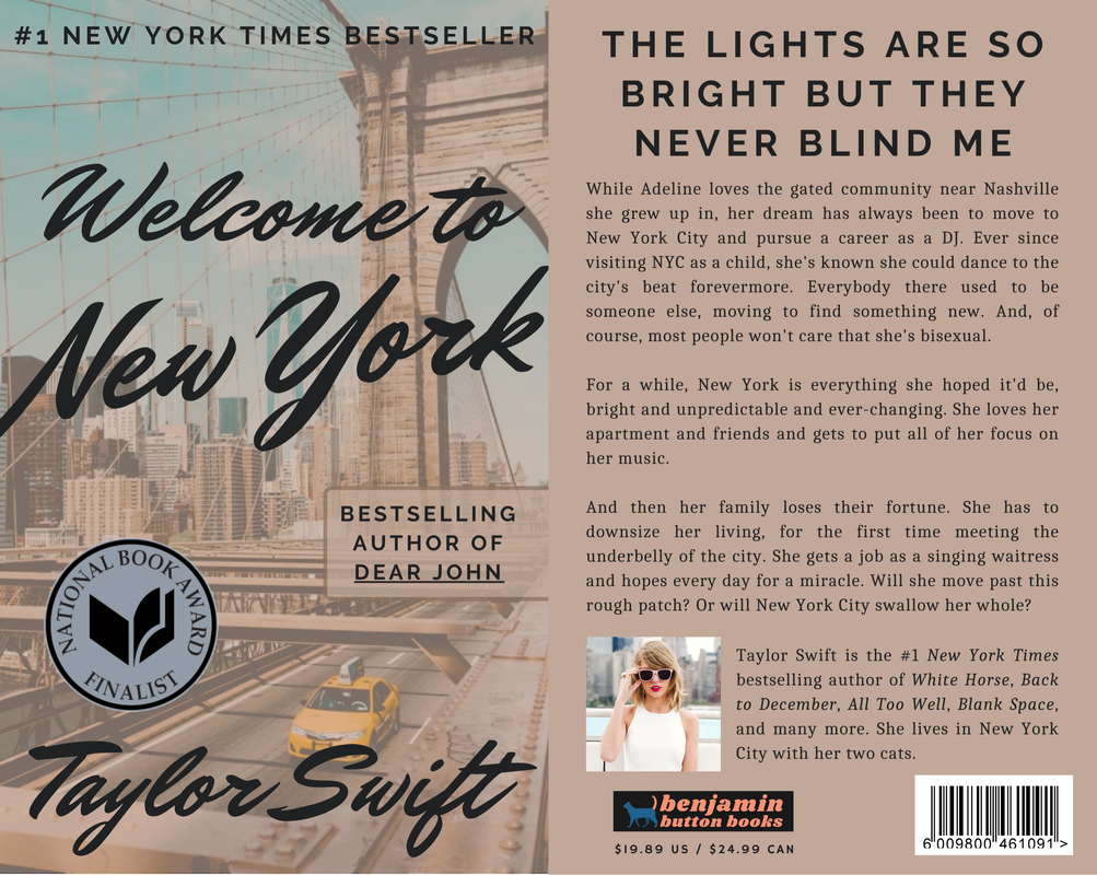
1. WELCOME TO NEW YORK
"Welcome to New York" is probably one of the most controversial Taylor songs. It's been called both the best and worst anthem for NYC. I think for me, while it's not her best, I still love and respect it. I wanted the cover to look almost like a vintage post card. For the plot, I focused on adding in that it's a very romanticized, wealthy view of the city, one of the main complaints in reviews of the song.
"Welcome to New York" is probably one of the most controversial Taylor songs. It's been called both the best and worst anthem for NYC. I think for me, while it's not her best, I still love and respect it. I wanted the cover to look almost like a vintage post card. For the plot, I focused on adding in that it's a very romanticized, wealthy view of the city, one of the main complaints in reviews of the song.
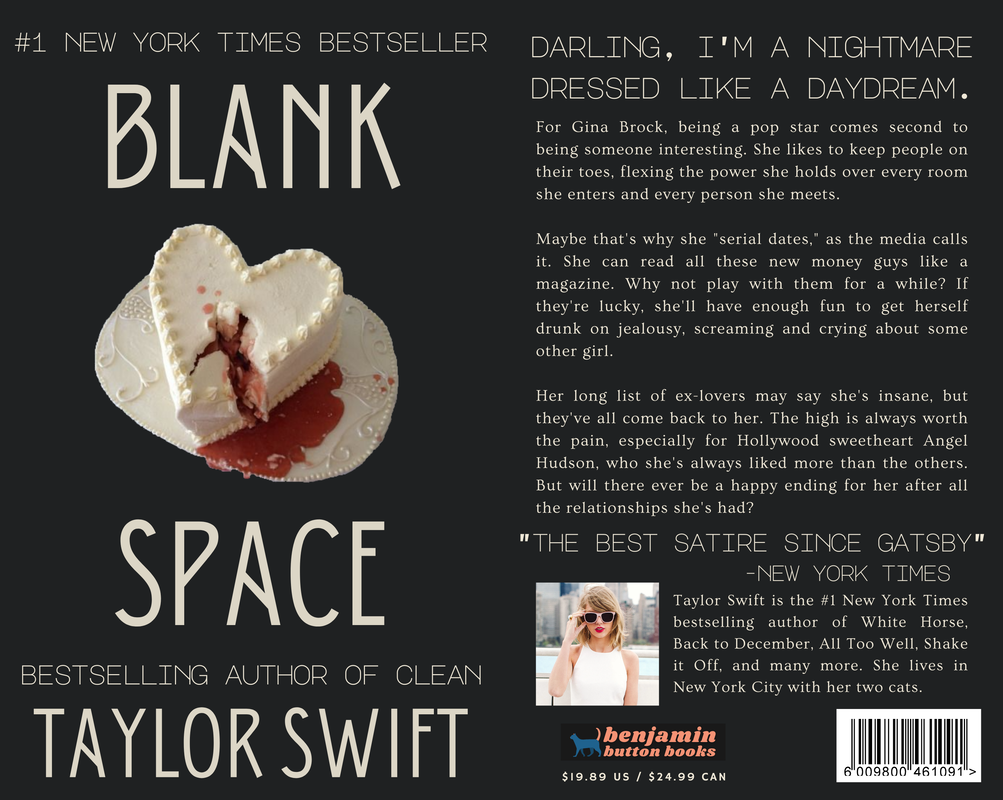
2. BLANK SPACE
This is one of my favorites out of all the covers I've made so far. It's so clean and different. When I started building it, I considered using a full shot from the music video, but after rewatching, I knew it had to be just the bleeding heart cake. I cut the image myself, which is why it's a little messy, but in the end it worked exactly like I wanted it to. The bio was tough to write and isn't as clear as some of the others, but I think it still conveys the song. My favorite part is "the best satire since Gatsby;" that just works so well for the song.
This is one of my favorites out of all the covers I've made so far. It's so clean and different. When I started building it, I considered using a full shot from the music video, but after rewatching, I knew it had to be just the bleeding heart cake. I cut the image myself, which is why it's a little messy, but in the end it worked exactly like I wanted it to. The bio was tough to write and isn't as clear as some of the others, but I think it still conveys the song. My favorite part is "the best satire since Gatsby;" that just works so well for the song.
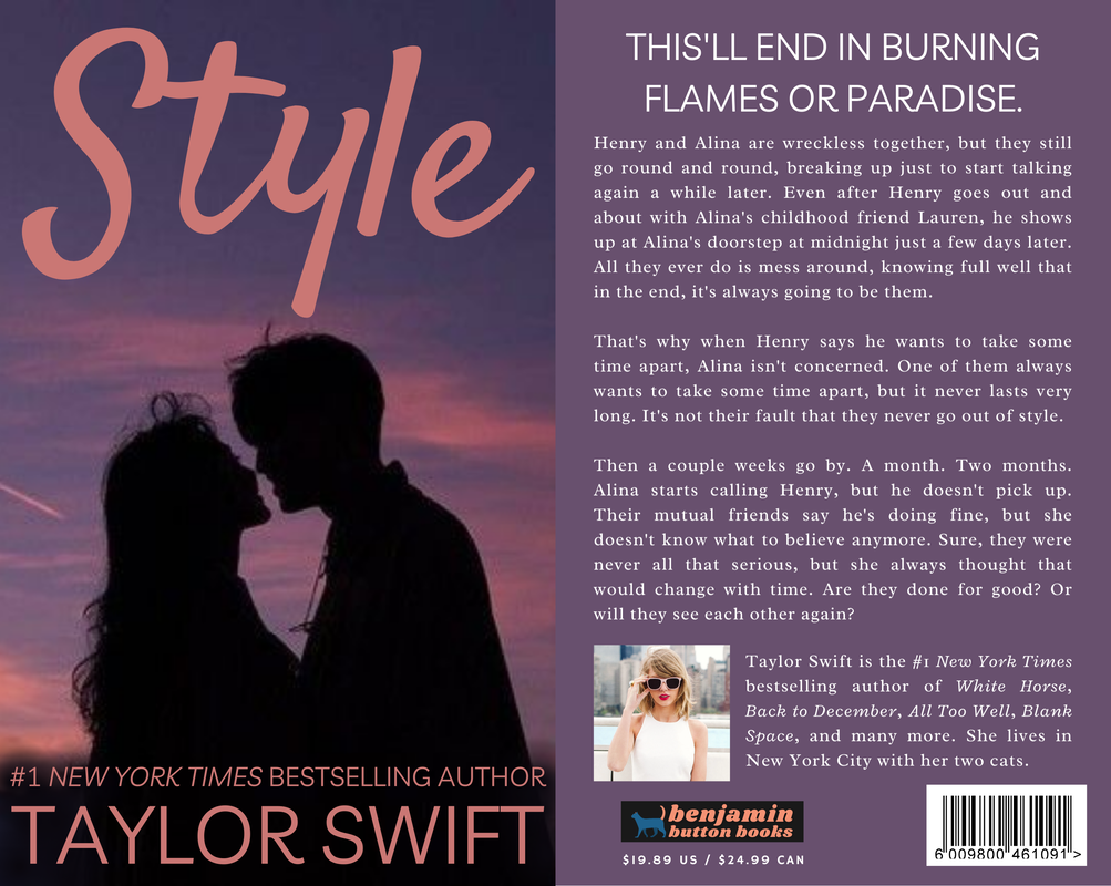
3. STYLE
The cover for "Style" is a little basic, but I feel like a book version of "Style" would be basic (no slander on the song, of course, I'll love that song until I die). The blurb fits the song nicely, something I'm especially proud of because rather than directly telling the story, "Style" gives snapshots of a relationship and expects the listener to put the pieces together. That gave me more creative freedom compared to a more story-driven song like Speak Now's "Mine."
The cover for "Style" is a little basic, but I feel like a book version of "Style" would be basic (no slander on the song, of course, I'll love that song until I die). The blurb fits the song nicely, something I'm especially proud of because rather than directly telling the story, "Style" gives snapshots of a relationship and expects the listener to put the pieces together. That gave me more creative freedom compared to a more story-driven song like Speak Now's "Mine."
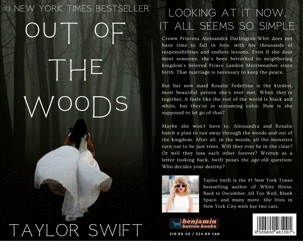
4. OUT OF THE WOODS
I love this book cover. I would read this, a hundred percent. It's just so unexpected for a song that mentions Polaroids and a car crash, with its royalty and fictional kingdoms and star-crossed lovers. Because this is such an iconic song, I needed the book cover to be pretty separate from the song or it would've been mediocre (don't worry, though, there would definitely be a carriage crash at the climax). My favorite part is probably the font, which took a while to find but was definitely worth it.
I love this book cover. I would read this, a hundred percent. It's just so unexpected for a song that mentions Polaroids and a car crash, with its royalty and fictional kingdoms and star-crossed lovers. Because this is such an iconic song, I needed the book cover to be pretty separate from the song or it would've been mediocre (don't worry, though, there would definitely be a carriage crash at the climax). My favorite part is probably the font, which took a while to find but was definitely worth it.
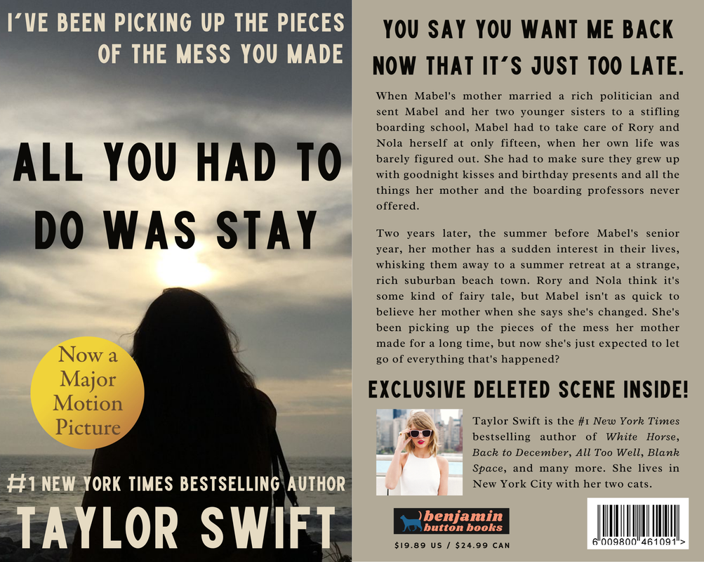
5. ALL YOU HAD TO DO WAS STAY
After I made this cover, I knew it needed the "major motion picture" sticker. That photo is definitely from a Lionsgate teen melodrama that earned hundreds of millions of dollars and owned the back half of the summer. Writing the blurb, I'd just finished the "How You Get the Girl" cover and knew the plots would be too similar if the book was another romance, despite the song of "AYHTDWS" actually being about a romantic relationship. Instead, I switched it out with a mother-daughter bond that I thought still fit.
After I made this cover, I knew it needed the "major motion picture" sticker. That photo is definitely from a Lionsgate teen melodrama that earned hundreds of millions of dollars and owned the back half of the summer. Writing the blurb, I'd just finished the "How You Get the Girl" cover and knew the plots would be too similar if the book was another romance, despite the song of "AYHTDWS" actually being about a romantic relationship. Instead, I switched it out with a mother-daughter bond that I thought still fit.
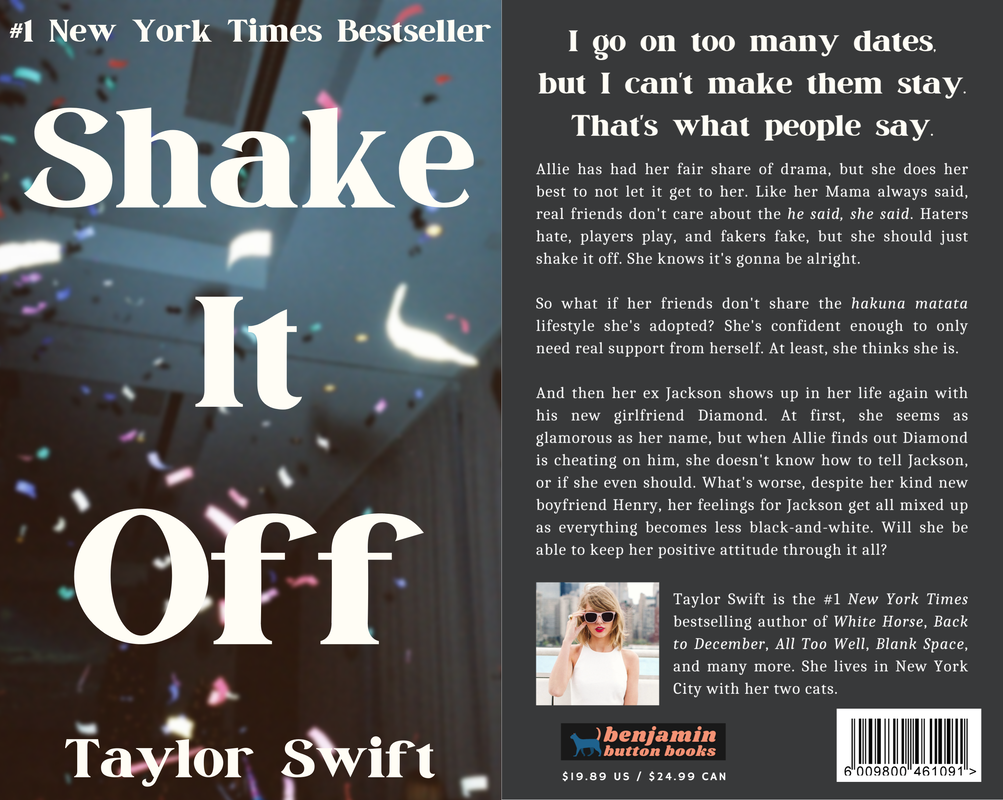
6. SHAKE IT OFF
Another iconic song, but this time it wasn't nearly as intimidating as "OOTW" because I first fell in love with "Shake it Off" a long, long time ago, so this cover felt more like homage to a classic than anything. The picture completely screams "Shake it Off," which I feel like is secretly a dark song, talking about having to ignore everything people say. In the photo, there's confetti like a party, but it's also in some kind of dingey-to-average public setting, shown by the walls and ceiling. Also, side note, the plot is slightly off because I somehow never understood what she meant at the end of the bridge. I though "I'm just gonna shake / into the fella over there with the hella good hair" (I know it's "and to" not "into," but I can't accept that many changes at once) was a continuation of what her "ex man's new girlfriend" is saying, but Taylor ignores it because she's focused on herself. That threw off my plot matching, but I still love it.
Another iconic song, but this time it wasn't nearly as intimidating as "OOTW" because I first fell in love with "Shake it Off" a long, long time ago, so this cover felt more like homage to a classic than anything. The picture completely screams "Shake it Off," which I feel like is secretly a dark song, talking about having to ignore everything people say. In the photo, there's confetti like a party, but it's also in some kind of dingey-to-average public setting, shown by the walls and ceiling. Also, side note, the plot is slightly off because I somehow never understood what she meant at the end of the bridge. I though "I'm just gonna shake / into the fella over there with the hella good hair" (I know it's "and to" not "into," but I can't accept that many changes at once) was a continuation of what her "ex man's new girlfriend" is saying, but Taylor ignores it because she's focused on herself. That threw off my plot matching, but I still love it.
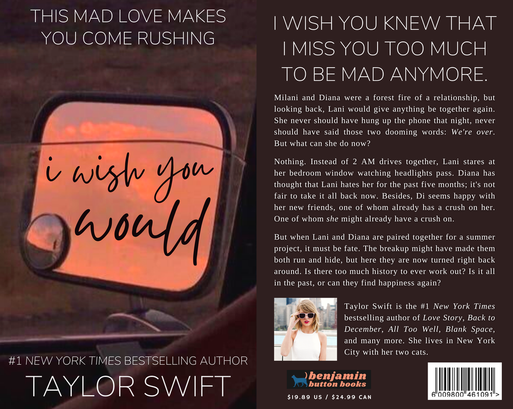
7. I WISH YOU WOULD
When I made the cover for "I Wish You Would," I was beyond proud, and honestly, I still love it. Placing the text neatly on the mirror was hard to say the least, but it turned out beautiful and really does look like a book version of the song. The blurb is faithful to the song, which is always good, while still being its own, using the same midnight headlights imagery but adding in larger plot points.
When I made the cover for "I Wish You Would," I was beyond proud, and honestly, I still love it. Placing the text neatly on the mirror was hard to say the least, but it turned out beautiful and really does look like a book version of the song. The blurb is faithful to the song, which is always good, while still being its own, using the same midnight headlights imagery but adding in larger plot points.
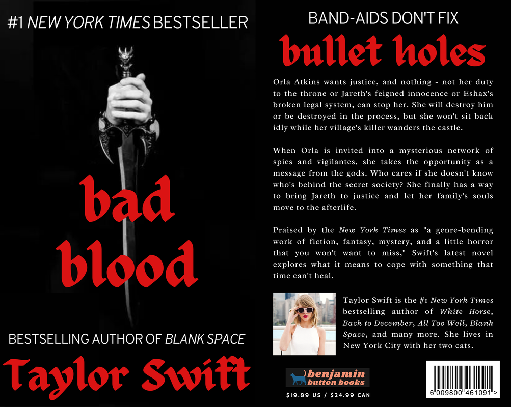
8. BAD BLOOD
"Bad Blood" was probably the hardest out of all the 1989 songs. Originally, I wanted to make something similar to the official music video movie posters and replicate the plot from that, but it looked unnatural when reworked for a book. Instead, I went in a completely opposite direction, creating some kind of fantasy-horror dark academia hybrid. The song left a lot of details open for interpretation, which was perfect because I could really get into this character's head and see her from my own unique perspective.
"Bad Blood" was probably the hardest out of all the 1989 songs. Originally, I wanted to make something similar to the official music video movie posters and replicate the plot from that, but it looked unnatural when reworked for a book. Instead, I went in a completely opposite direction, creating some kind of fantasy-horror dark academia hybrid. The song left a lot of details open for interpretation, which was perfect because I could really get into this character's head and see her from my own unique perspective.
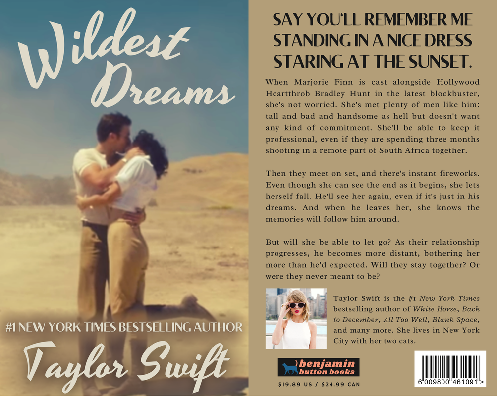
9. WILDEST DREAMS
In contrast to "Bad Blood," my "Wildest Dreams" cover is practically a replica of the music video, down to the main character's name, Marjorie Finn (although I stayed away from the movie poster Taylor features in the video). The wild west vibes are a must for this song, although the actual plot is very glam in its drama. Mostly, I wanted it to feel timeless, the way both the song and the video do.
In contrast to "Bad Blood," my "Wildest Dreams" cover is practically a replica of the music video, down to the main character's name, Marjorie Finn (although I stayed away from the movie poster Taylor features in the video). The wild west vibes are a must for this song, although the actual plot is very glam in its drama. Mostly, I wanted it to feel timeless, the way both the song and the video do.
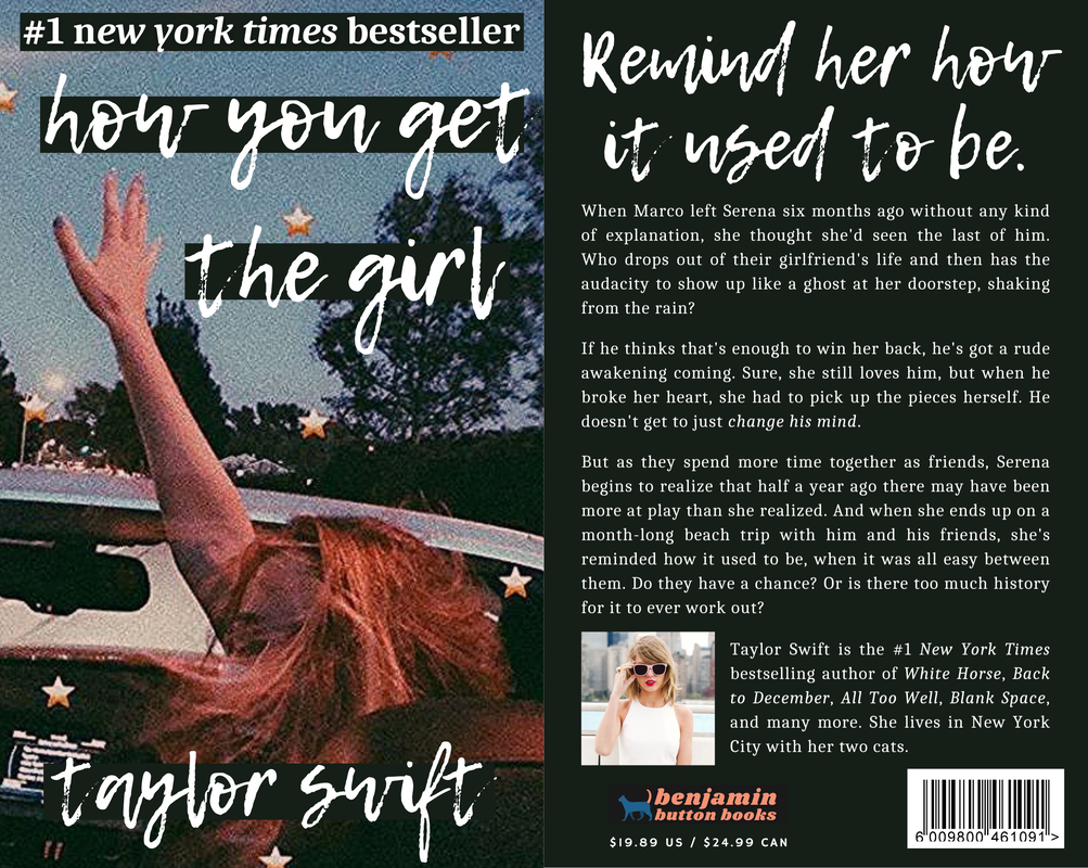
10. HOW YOU GET THE GIRL
Much like the song itself, this cover is a forgotten favorite for me. I found the photo already edited, even with the stars, and knew that I needed it for a 1989 song. It doesn't exactly fit the lyrics (somehow, this song doesn't mention a car drive), but I think it fits with the idea of a perfect, fleeting memory, similar to the line, "remind her how it used to be / with pictures in frames of kisses on cheeks." The plot gives very To All the Boys I've Loved Before, which is exactly what I was shooting for, so that turned out well.
Much like the song itself, this cover is a forgotten favorite for me. I found the photo already edited, even with the stars, and knew that I needed it for a 1989 song. It doesn't exactly fit the lyrics (somehow, this song doesn't mention a car drive), but I think it fits with the idea of a perfect, fleeting memory, similar to the line, "remind her how it used to be / with pictures in frames of kisses on cheeks." The plot gives very To All the Boys I've Loved Before, which is exactly what I was shooting for, so that turned out well.
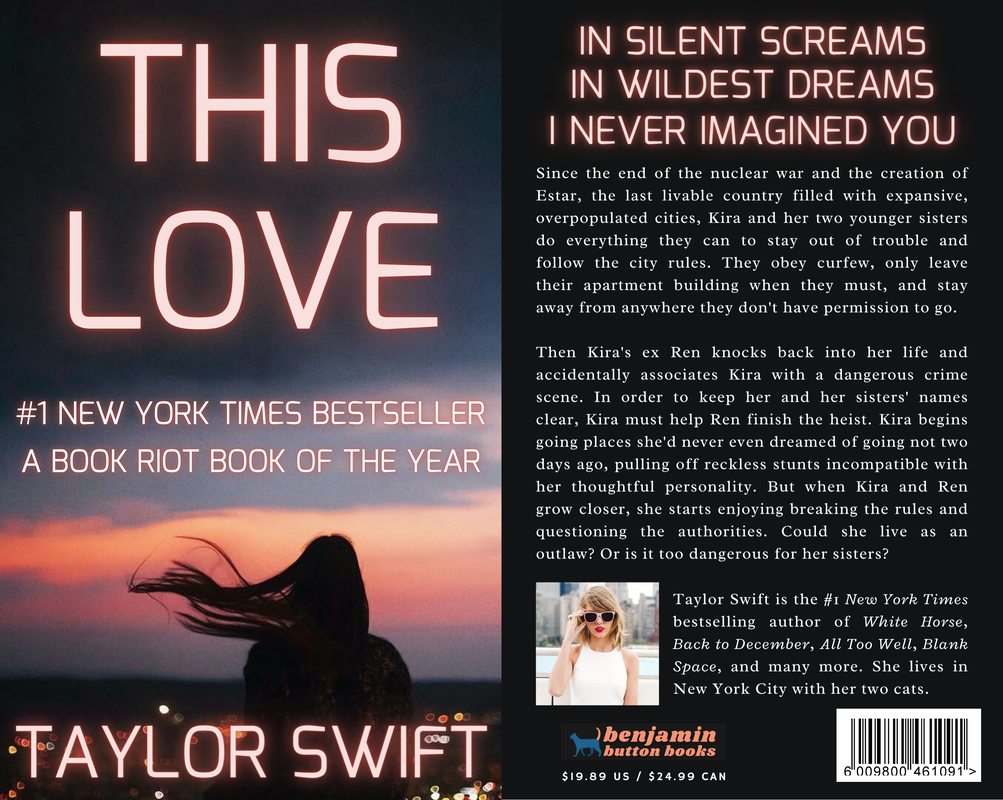
11. THIS LOVE
Once I found the background photo, this cover just sort of materialized out of nothing, honestly. The font and color scheme was easy to figure out, and the plot barely took any lyric prompting. Looking back at the song, I could have probably made it about gay pirates, which I regret not doing because queer pirate stories are literally the best thing ever, but when the cover makes itself and looks dystopian, it has to be dystopian. Besides, books set at sea almost always have illustrated covers. It's just one of their rules.
Once I found the background photo, this cover just sort of materialized out of nothing, honestly. The font and color scheme was easy to figure out, and the plot barely took any lyric prompting. Looking back at the song, I could have probably made it about gay pirates, which I regret not doing because queer pirate stories are literally the best thing ever, but when the cover makes itself and looks dystopian, it has to be dystopian. Besides, books set at sea almost always have illustrated covers. It's just one of their rules.
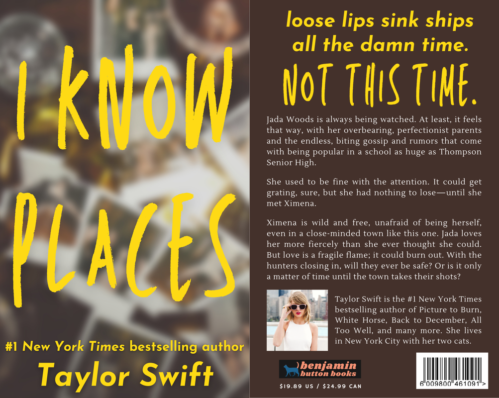
12. I KNOW PLACES
"I Know Places" was one of the very first covers I made, and unlike some of the other early drafts, it's barely changed since. The font is exactly what I would see on a YA cover and the Polaroids in the background are perfect for the song (although they do look spooky; I have to admit that it would work better as a mystery). The plot is great for the song and has an "OOTW" reference, although there's no connection between the books. Overall, it's pretty and definitely similar to something I might see in a bookstore.
"I Know Places" was one of the very first covers I made, and unlike some of the other early drafts, it's barely changed since. The font is exactly what I would see on a YA cover and the Polaroids in the background are perfect for the song (although they do look spooky; I have to admit that it would work better as a mystery). The plot is great for the song and has an "OOTW" reference, although there's no connection between the books. Overall, it's pretty and definitely similar to something I might see in a bookstore.
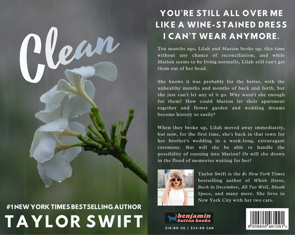
13. CLEAN
For the last song of the regular album, I knew I needed something special. I wanted it to look peaceful and pure, like the song sounds. The plot is a bit like the aftermath of a 90s rom com gone wrong, but that works perfectly with the song. "Clean" is a super special song to Swifties, especially after the release of the "Clean" speech at the 1989 World Tour, and a super special song for Taylor, whose relationship with rain is extremely important, so I focused on commemorating the original song in this cover.
For the last song of the regular album, I knew I needed something special. I wanted it to look peaceful and pure, like the song sounds. The plot is a bit like the aftermath of a 90s rom com gone wrong, but that works perfectly with the song. "Clean" is a super special song to Swifties, especially after the release of the "Clean" speech at the 1989 World Tour, and a super special song for Taylor, whose relationship with rain is extremely important, so I focused on commemorating the original song in this cover.
14. WONDERLAND
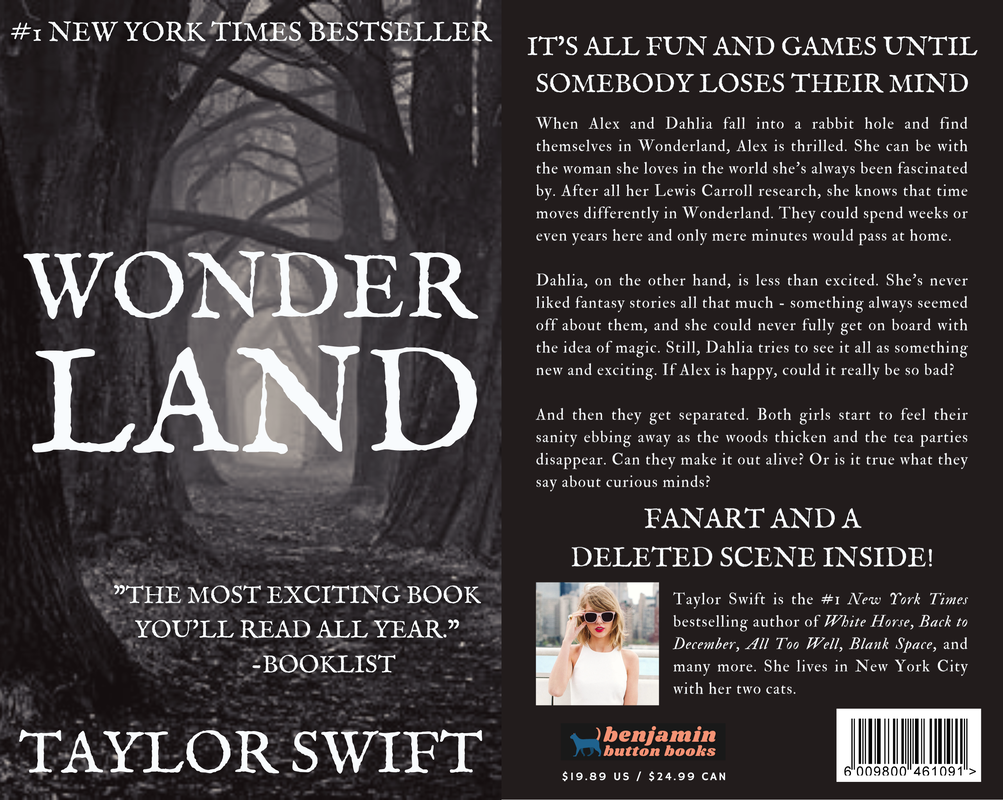
"Wonderland" is one of the most underrated Taylor songs ever. When I first heard the album straight through, I was shocked that I'd never heard it play before. It's romantic but twisted in a way that only Swift can do and filled to the brim with real-life references that the media has always loved dissecting in songs from her. I knew the cover I made had to be super unique, and at first, I had a soft, cottagecore-ish cover until looking at the lyrics again and realizing that the song is much too dark to fit that. I instead went in the complete opposite direction, making a horror descent into madness novel.
"Wonderland" is one of the most underrated Taylor songs ever. When I first heard the album straight through, I was shocked that I'd never heard it play before. It's romantic but twisted in a way that only Swift can do and filled to the brim with real-life references that the media has always loved dissecting in songs from her. I knew the cover I made had to be super unique, and at first, I had a soft, cottagecore-ish cover until looking at the lyrics again and realizing that the song is much too dark to fit that. I instead went in the complete opposite direction, making a horror descent into madness novel.
15. YOU ARE IN LOVE
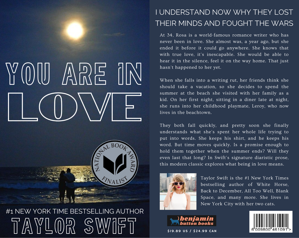
Although it's not mentioned much by Swifties, "You Are In Love" has one of the most important and emotional lyrics on the album: "you understand now / … / why I've spent my whole life trying to put it into words." At the time, this song was the essence of everything Taylor had ever made, a combination of imagery and storytelling focused on real, true love. Making this cover, I knew I needed something peaceful, a little bit cheesy but still classic, and above all, able to use the above lyric in the blurb. I made the main character a romance novelist, which I'm completely obsessed with, considering in this AU, Taylor is mostly a romance novelist.
Although it's not mentioned much by Swifties, "You Are In Love" has one of the most important and emotional lyrics on the album: "you understand now / … / why I've spent my whole life trying to put it into words." At the time, this song was the essence of everything Taylor had ever made, a combination of imagery and storytelling focused on real, true love. Making this cover, I knew I needed something peaceful, a little bit cheesy but still classic, and above all, able to use the above lyric in the blurb. I made the main character a romance novelist, which I'm completely obsessed with, considering in this AU, Taylor is mostly a romance novelist.
16. NEW ROMANTICS
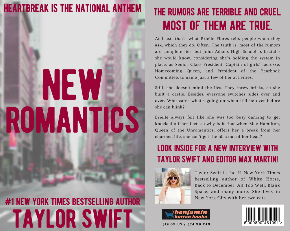
I love "New Romantics." It could very well be my favorite Taylor Swift song (that's a lie; I have about a hundred favorites and can never pick, similar to ranking her albums). I feel like the whole time Taylor is winking at the listener, knowing everything she's singing is overdramatic but also not caring because it's probably pretty true, too. The first cover I made for this song was very different from what you see here. I was super proud of it, but when I revisited it later, I realized it was kind of ugly. I kept all the elements I could, like the photo, which was a great find, but changed a lot of it, including a good chunk of the blurb. I wanted the plot to feel as high school as the song sounds, so I tried to put in as many clique-ish elements I could, including my personal favorite, the love interest's title "Queen of the Unromantics."
Thank you for reading! I know this is one of my more unusual posts, but making these covers has been such a fun experience for me and I wanted to share! 1989 will forever be one of the greatest pop albums of all time, so even though there's a lot to live up to, I hope you liked my reimagined versions. Which was your favorite? I've got to go with either "Blank Space" or "Out of the Woods." One of my favorite parts of doing this project was adding the little details, like including song lyrics in the blurbs, writing a bio that fits where she was in her life, and changing the price to "$19.89 USD."
The school year is ending right now, and while I hope to continue posting throughout the summer, I might go quiet for a few months. I have about a million things to do over the summer, and my usual go-to writing project right now isn't the blog. But I hope to upload still anyway! Until next time, keep reading, readers.
